Mitchell Press
Producing Excellence, Together: How Mitchell Press Evolved for the Future
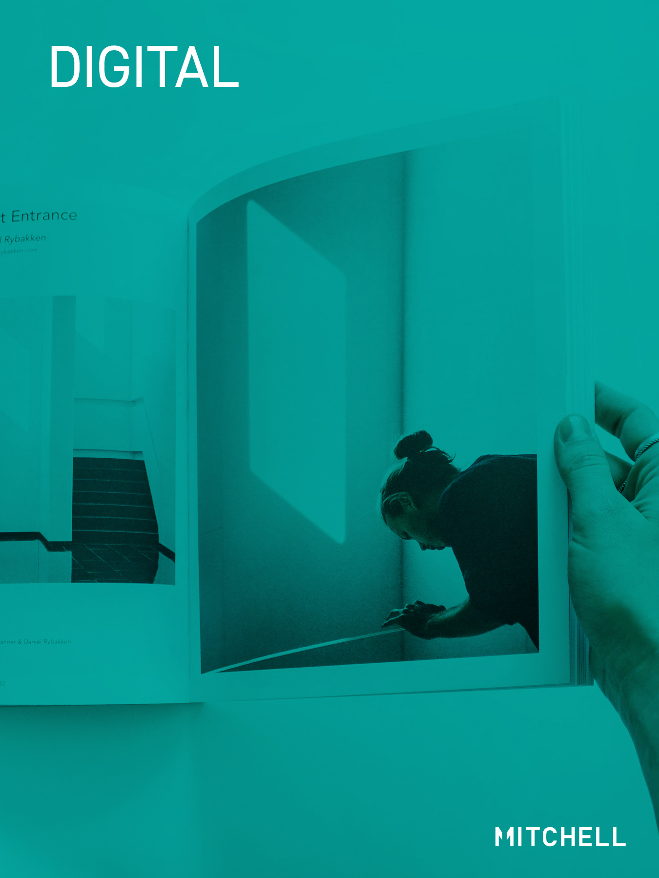
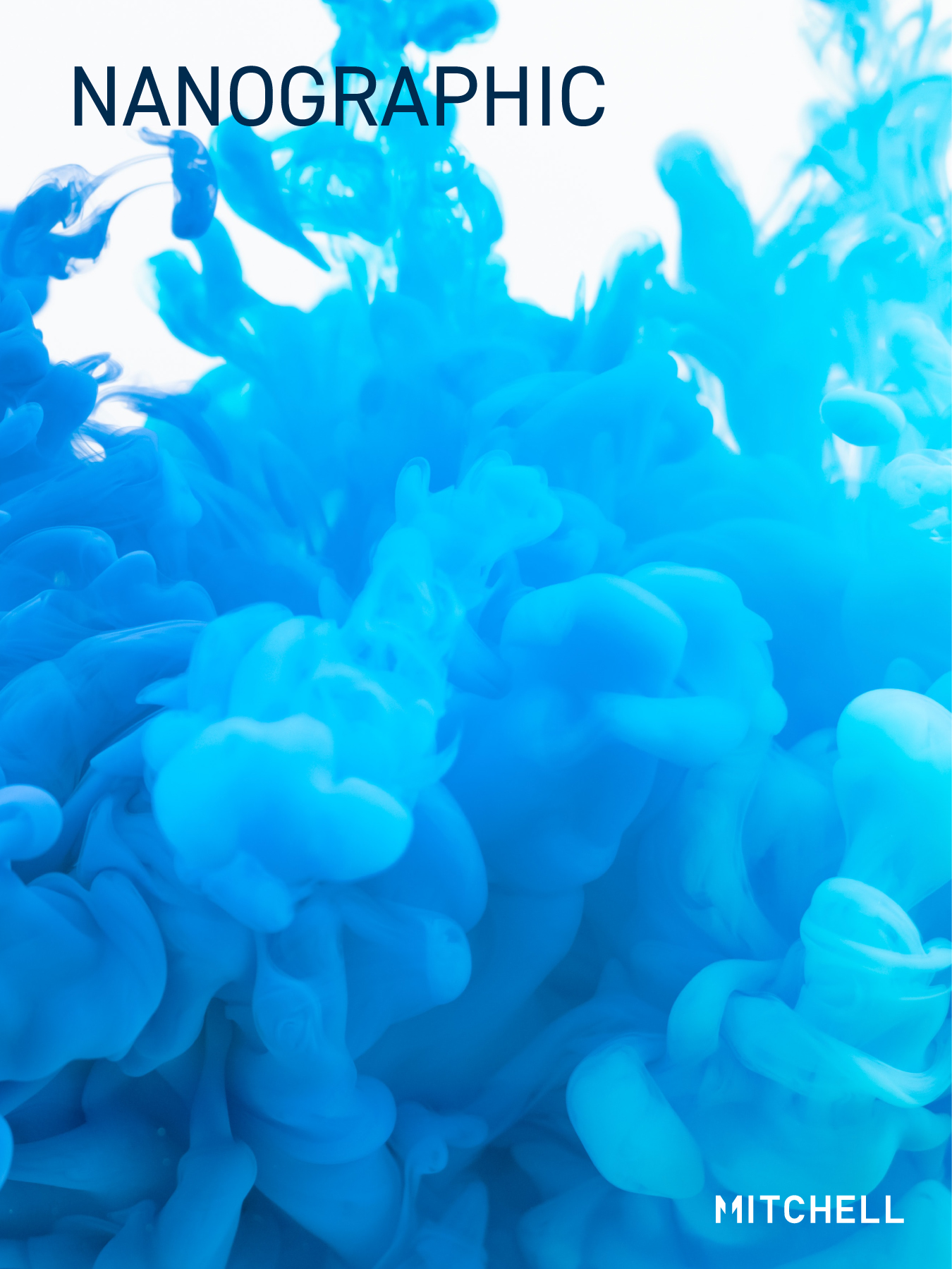
Established in 1928, Mitchell Press is one of the Canada’s largest commercial printing companies with a legacy of industry achievements. Adopting the Landa Nanographic Printing Press marked a major step forward in their commitment to innovation and sustainability. The company required a brand identity that reflected their evolution and decades of adapting to market demands.
Mitchell Press engaged Boyle Design to update the 94-year-old brand identity.
From Quality to Partnership: A Strategy for Differentiation
In today’s digital-first world, excellent quality is a baseline expectation in the printing industry, making differentiation crucial. Eco-conscious clients increasingly value environmentally friendly practices, a commitment Mitchell exemplifies through low-energy processes and sustainable solutions.
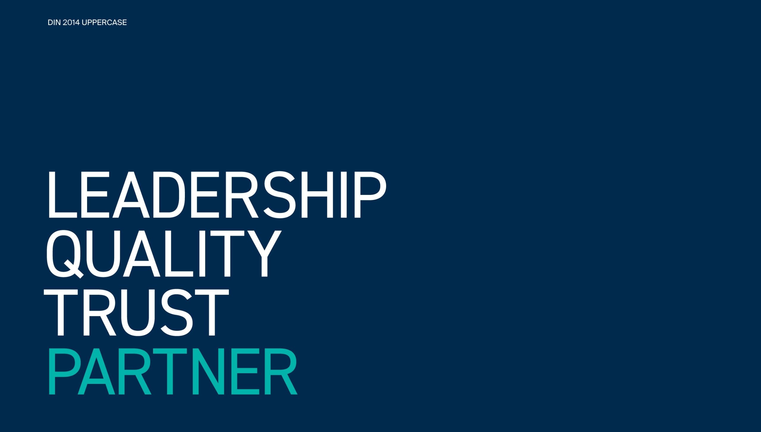
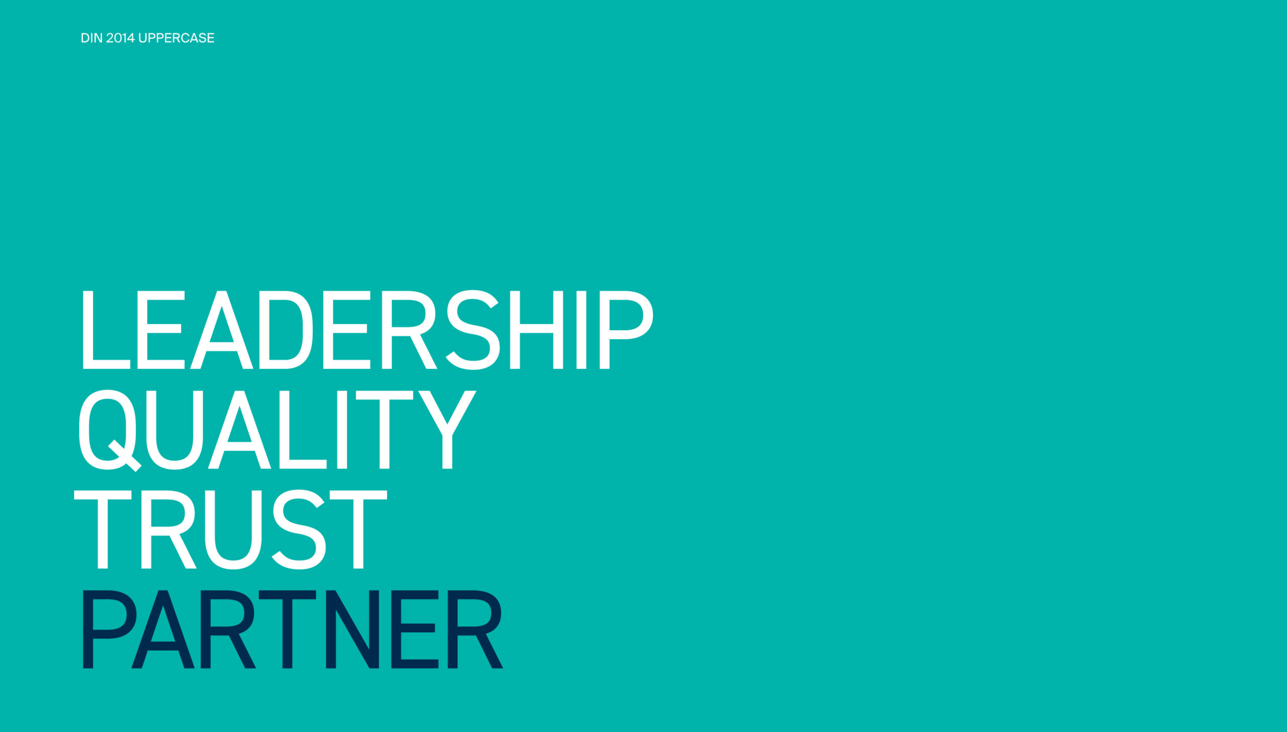
Through research and analysis, we discovered that Mitchell’s strengths extend beyond producing exceptional results—their emphasis on relationships, customer experience, and internal culture are equally pivotal. Their collaborative approach, streamlined workflows, and innovative tools provide operational ease that complements their industry-leading print quality. Mitchell’s long-standing reputation as a trusted partner further sets them apart.
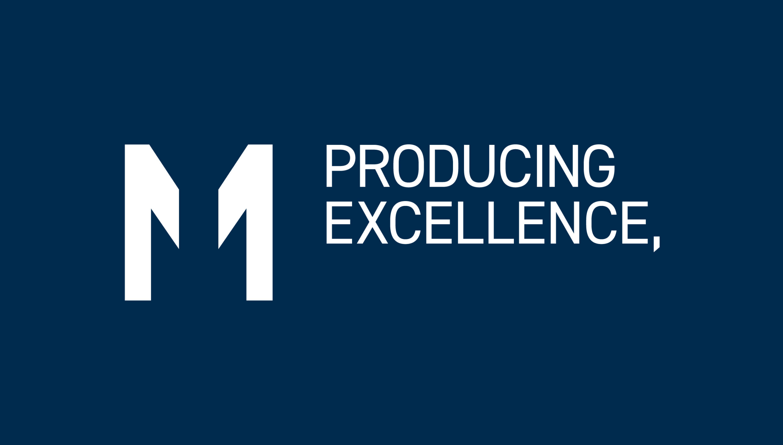
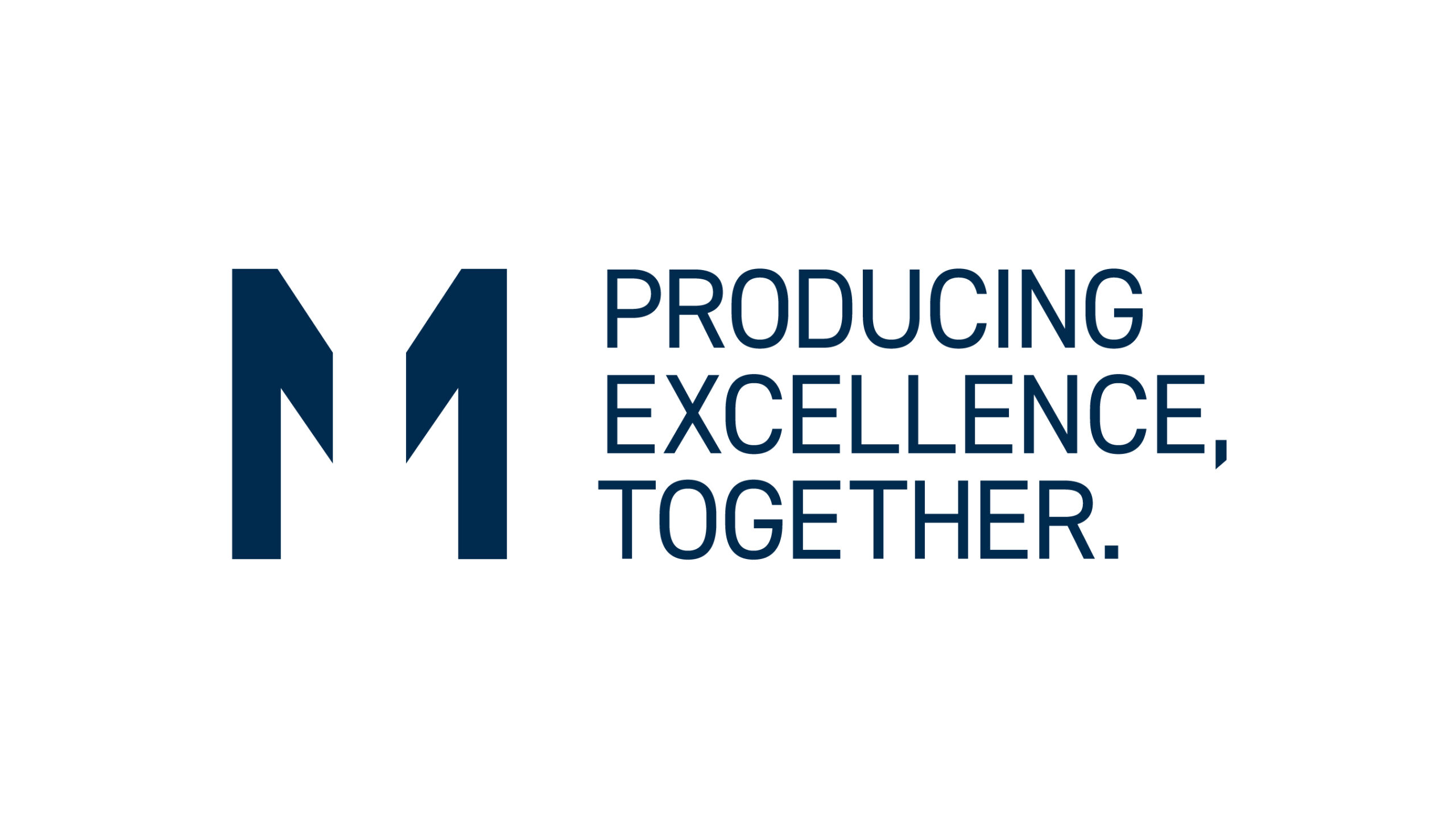
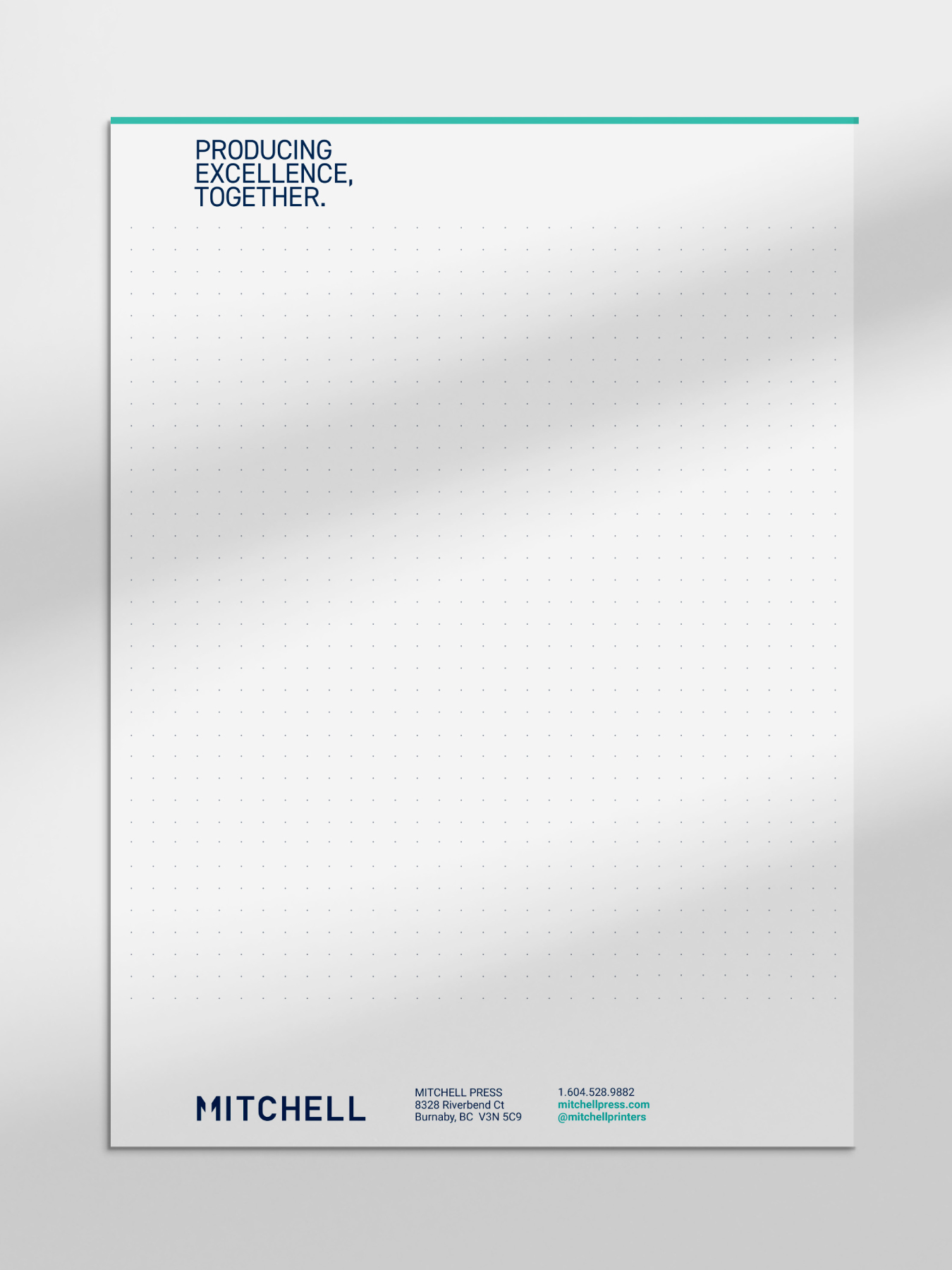
From this foundation, we developed Mitchell’s unique selling proposition: “Producing Excellence, Together.”
This message highlights their collaborative focus, positions excellence as a standard, and creates an emotional connection with clients. The emphasis on “together” reinforces Mitchell’s role as a partner in co-creating impactful, high-quality work.
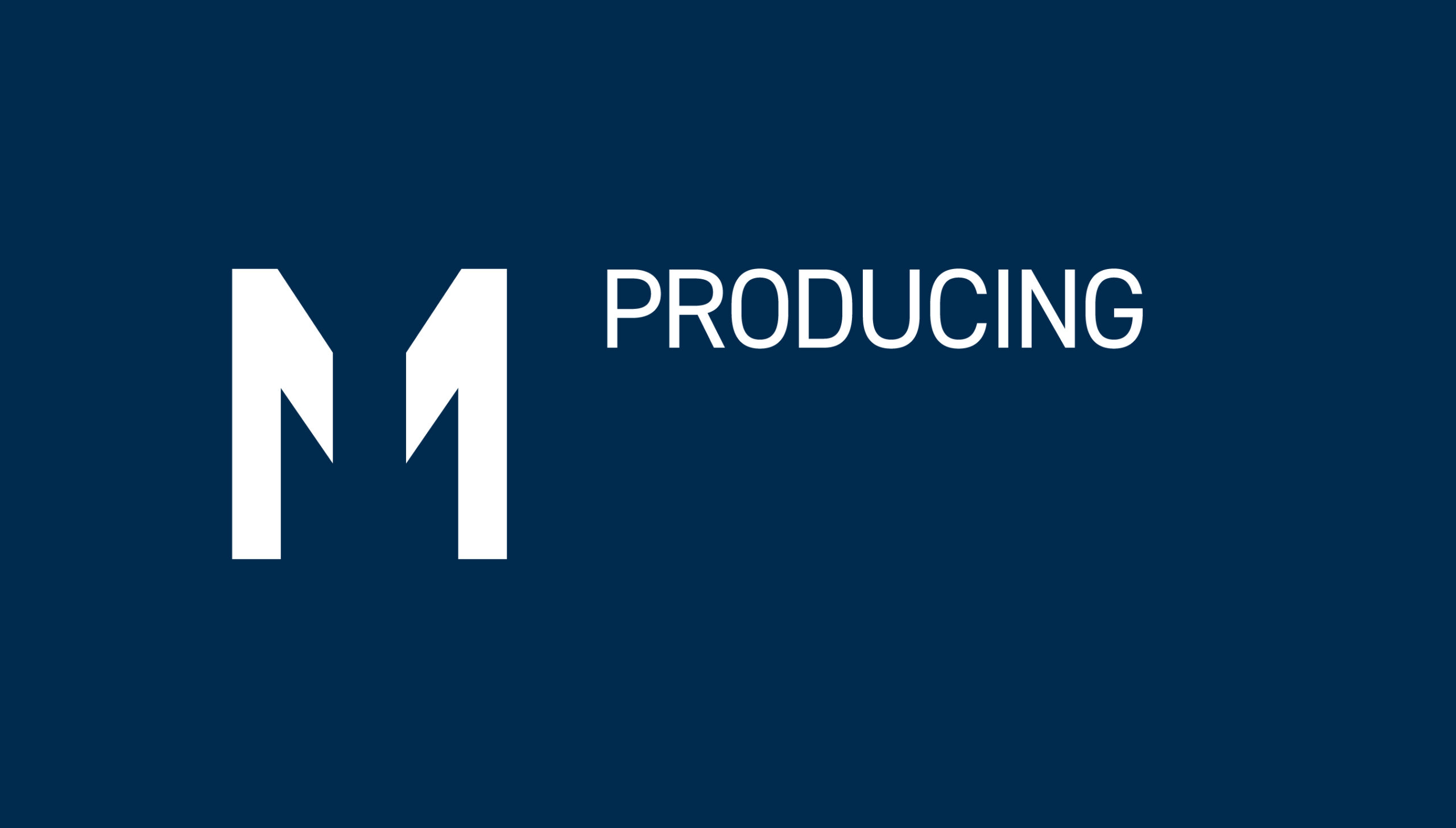
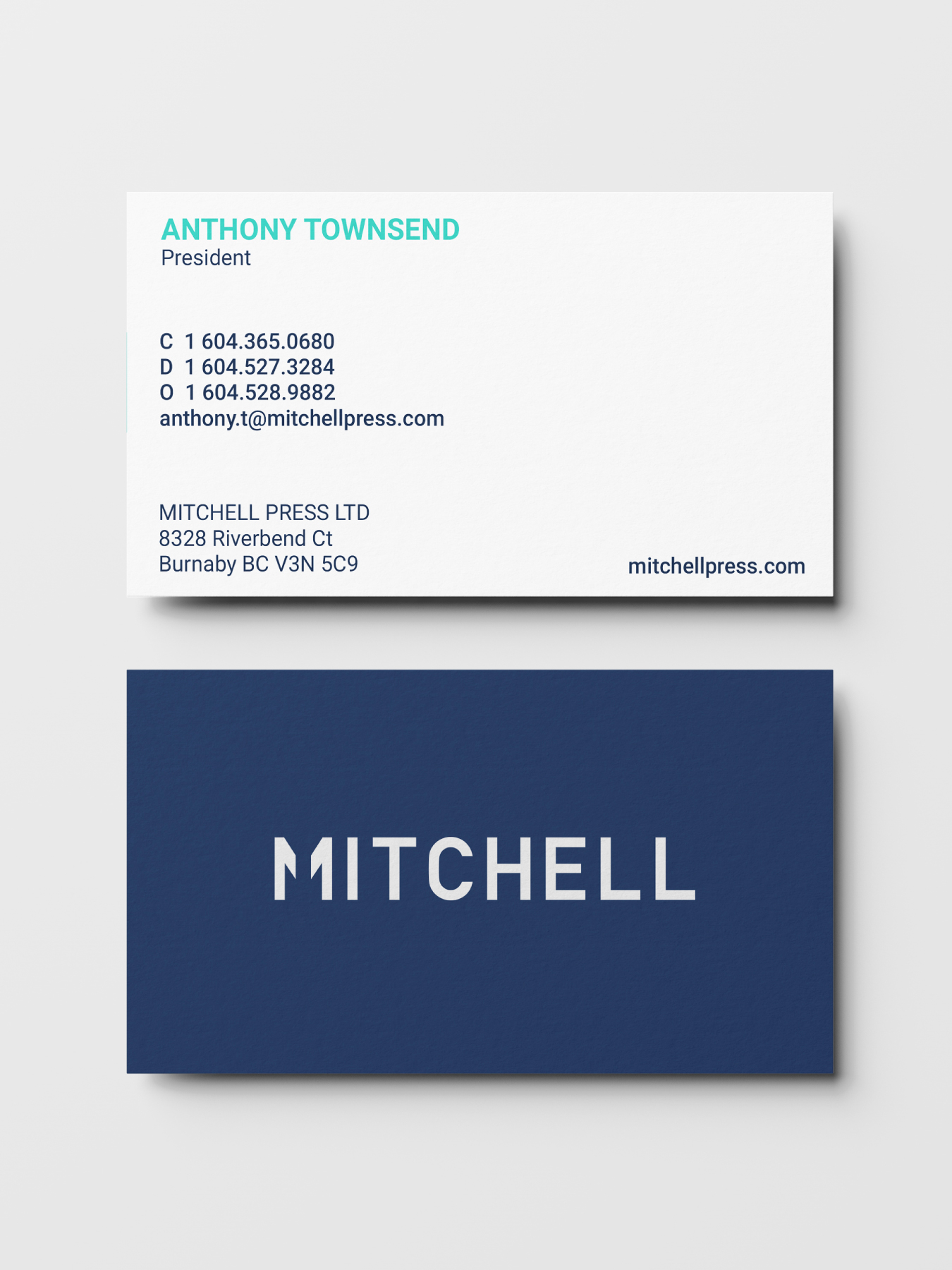
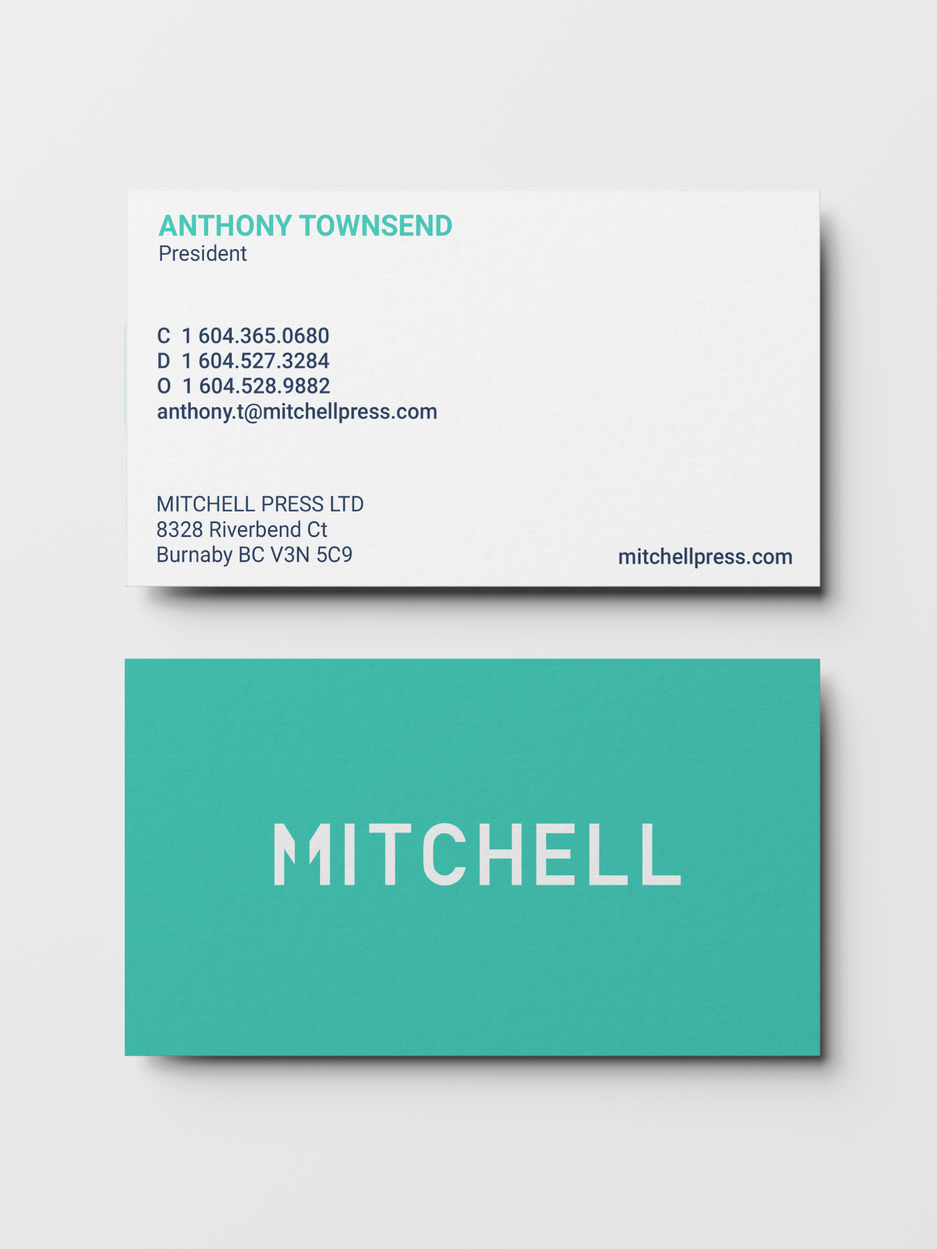
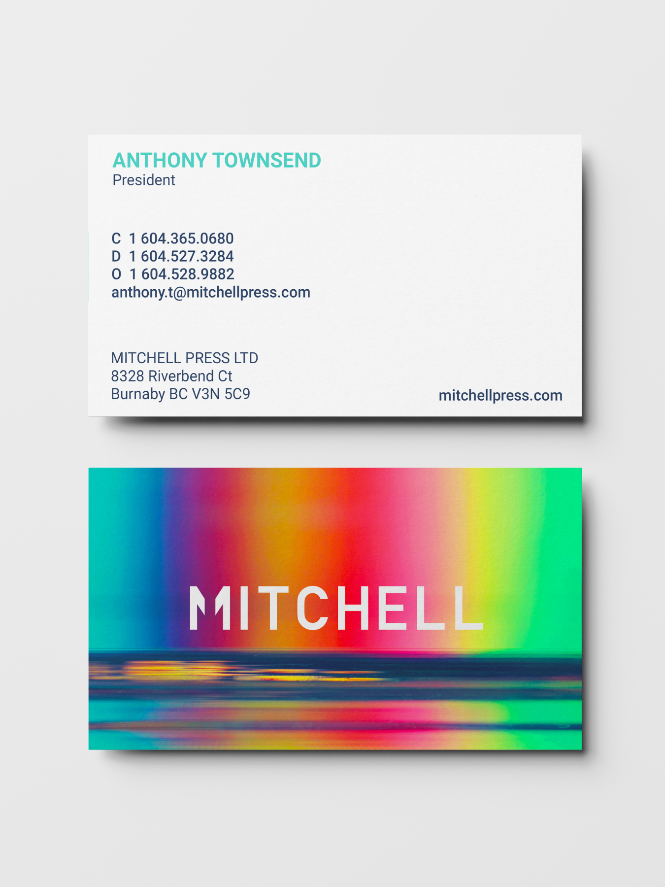
The rebrand also introduced a new logo that visually represents this collaboration. The two halves of the ‘capital M’ come together to form a unified mark, symbolizing the partnership between Mitchell and their clients. This design reinforces their values of connection, cooperation, and shared success.
Mitchell specializes in high-end print solutions. The negative space within the ‘Mitchell M’ subtly mirrors a press sheet, reinforcing their craft at a conceptual level.


From Innovation to Impact: The Results of Mitchell’s Rebrand
The modernized branding has resonated with eco-conscious and innovation-driven clients, driving awareness and engagement. The focus on collaboration and streamlined processes has only enhanced Mitchell’s reputation for operational excellence and partnership, and positioned the company for continued leadership in a competitive and evolving industry. While Mitchell’s legacy remains strong, it now fully embraces the future.
Boyle’s approach to defining us through our intentions, and researching our clients, teams, and leadership’s perspectives provided confidence that we were on the right track. They pushed us to redefine our story well before looking at logos and they helped define the essence of what we do, and aspire to be. Their precise use of language, tone, and appropriate metaphors connected the dots for us.
Our internal communications and company personality has become far more organic. All team members within our walls understands and embodies our new USP “Producing Excellence, Together”. This is a simple call-to-arms for us to follow.
Externally, our new messaging resonates with prospective partners who are looking to solve a problem, and it enables richer conversations with them. This helps our sales team be less dependent on bid-to-quote, but engage in more holistic conversations of “what can a true partner really offer?” Long- term clients who have collaborated within specific services are pressed to ask us “so tell us how your other services can help us.
Scott Gray
Executive Vice President