
DesCan

Bringing Diverse Design Disciplines Together Under One Distinct Identity
For more than half a century, the Society of Graphic Designers of Canada had helped set standards for the profession.
But the industry had changed. Graphic and communication design had expanded into a far broader ecosystem of disciplines, practices, and roles, and the organization’s existing name no longer reflected the community it represented.
The challenge was not simply to modernize a legacy identity.
It was to create a broader platform for the future — one that could respect decades of professional equity while making the organization more relevant, inclusive, and useful to a changing design community.



Expanding the Idea of Who the Organization Represented
The existing GDC name carried significant history. That history mattered.
But it also increasingly narrowed the way the organization was understood.
Research and industry feedback pointed to a clear opportunity: the association needed a name and identity capable of representing a wider spectrum of design professionals without abandoning the standards, advocacy, and professional leadership it had established.
The new name — Design Professionals of Canada — broadened that mandate.
And because professional organizations are often known through shorthand, DesCan was developed as a more distinctive, practical, and ownable expression of the new organization.
Many professional organizations are known by their initials or acronym. To distinguish the Design Professionals of Canada, and for practical use and branding, a shorthand name—DesCan—was developed.
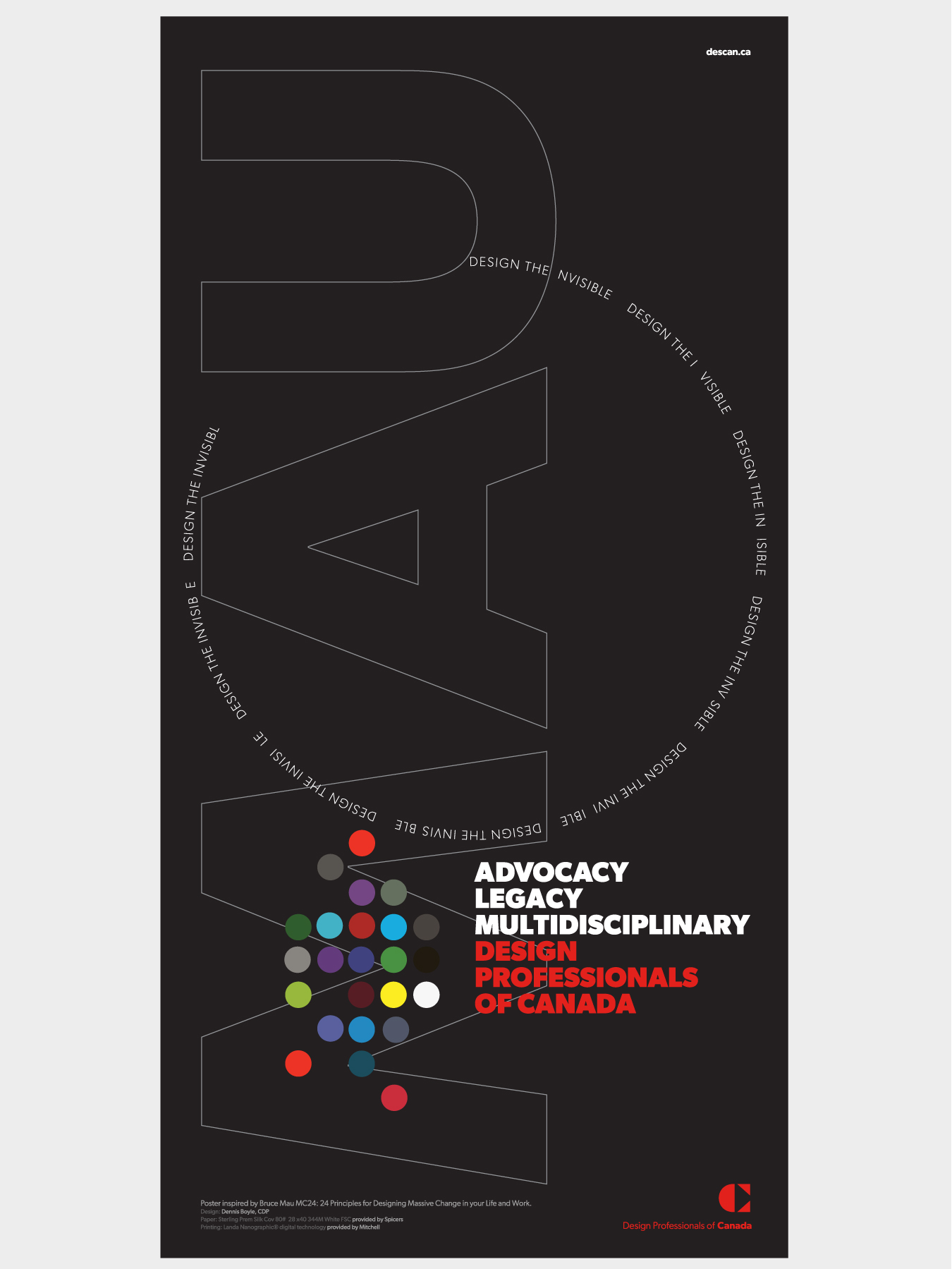
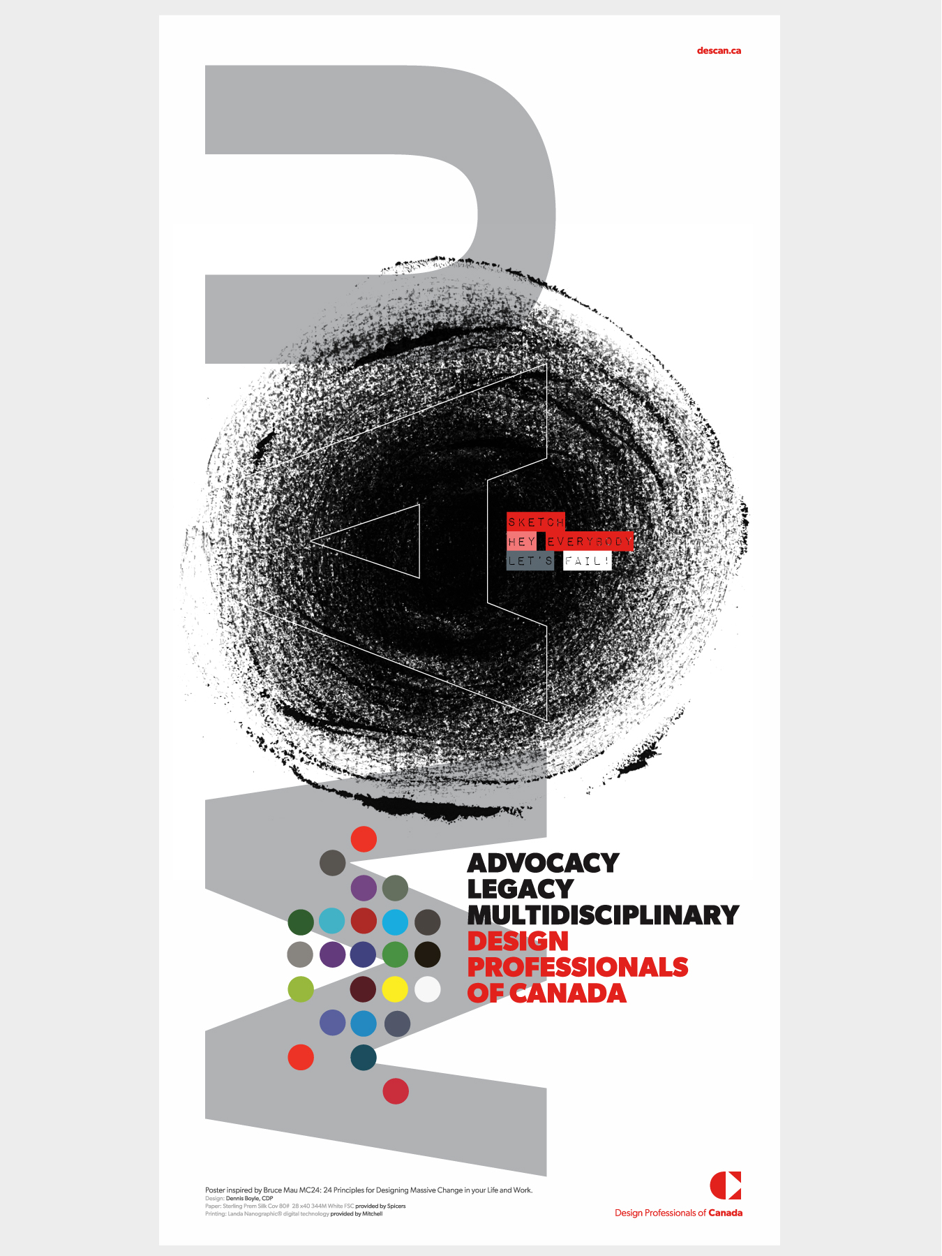
Building Continuity Into the Change
A rebrand of a long-established professional body carries unusual risk. Change too little and the organization remains tied to a definition it has outgrown. Change too much and it can lose the trust and recognition built over generations.
The new identity was therefore designed to signal evolution rather than rupture.
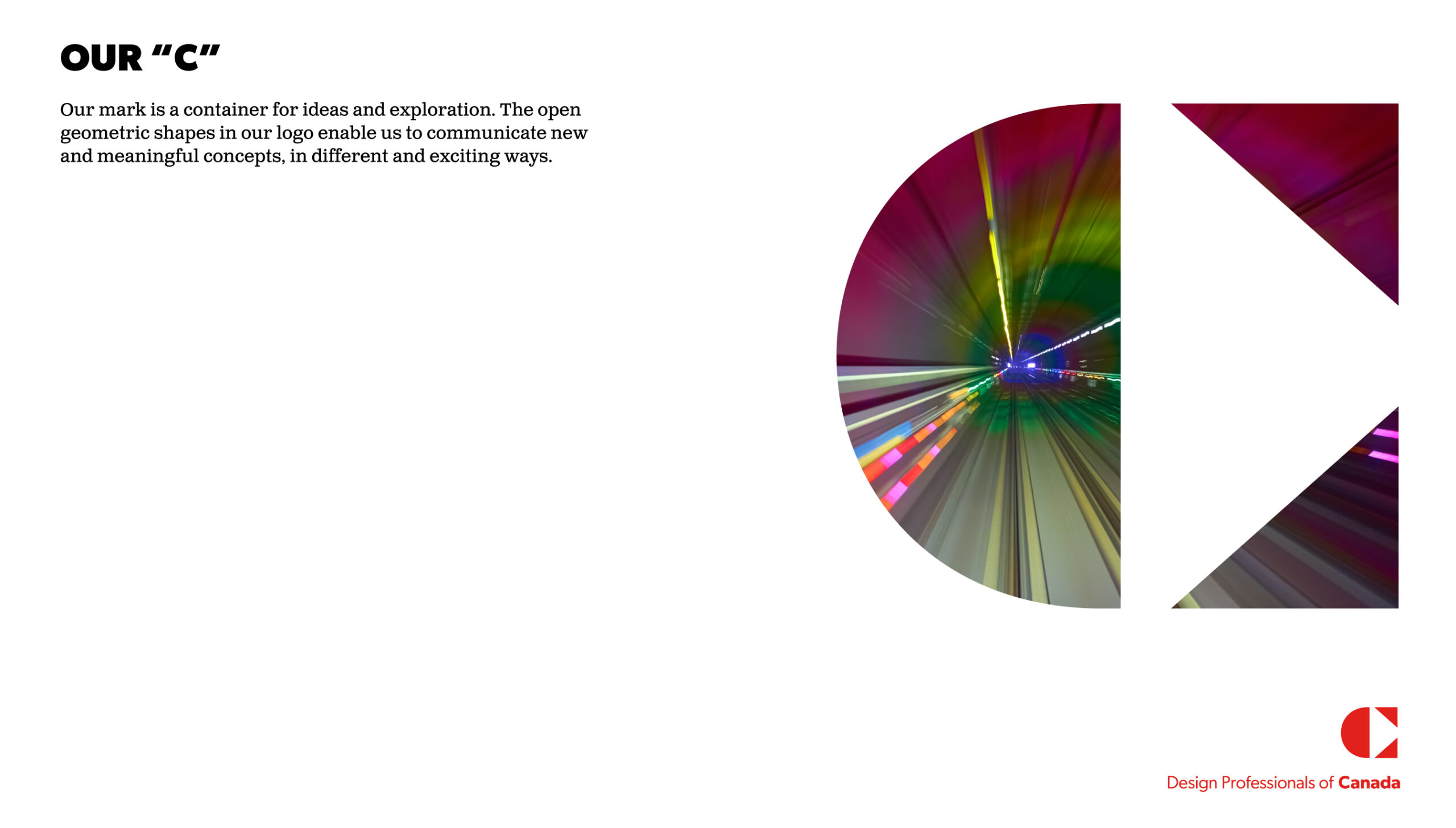
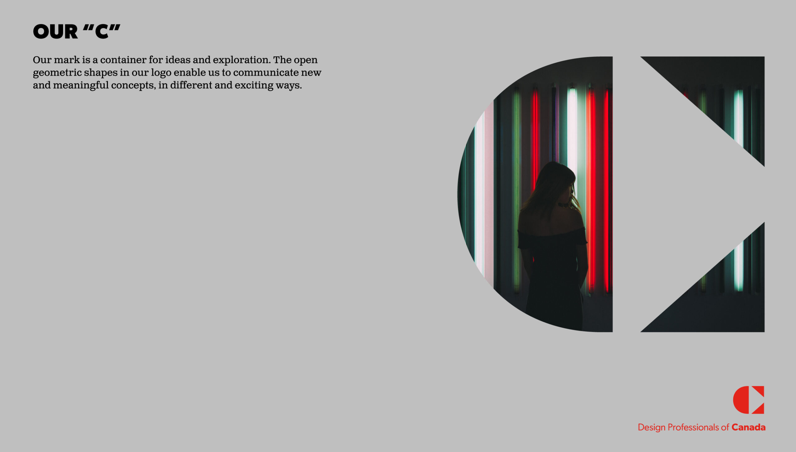
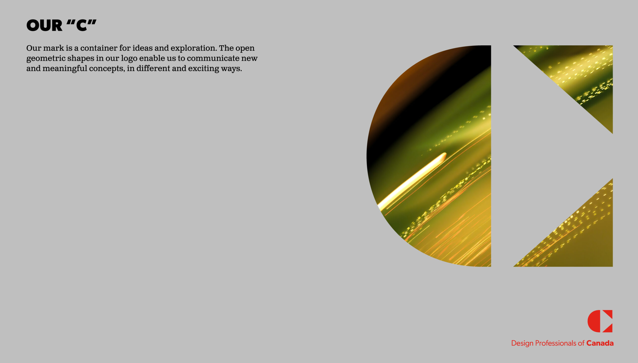
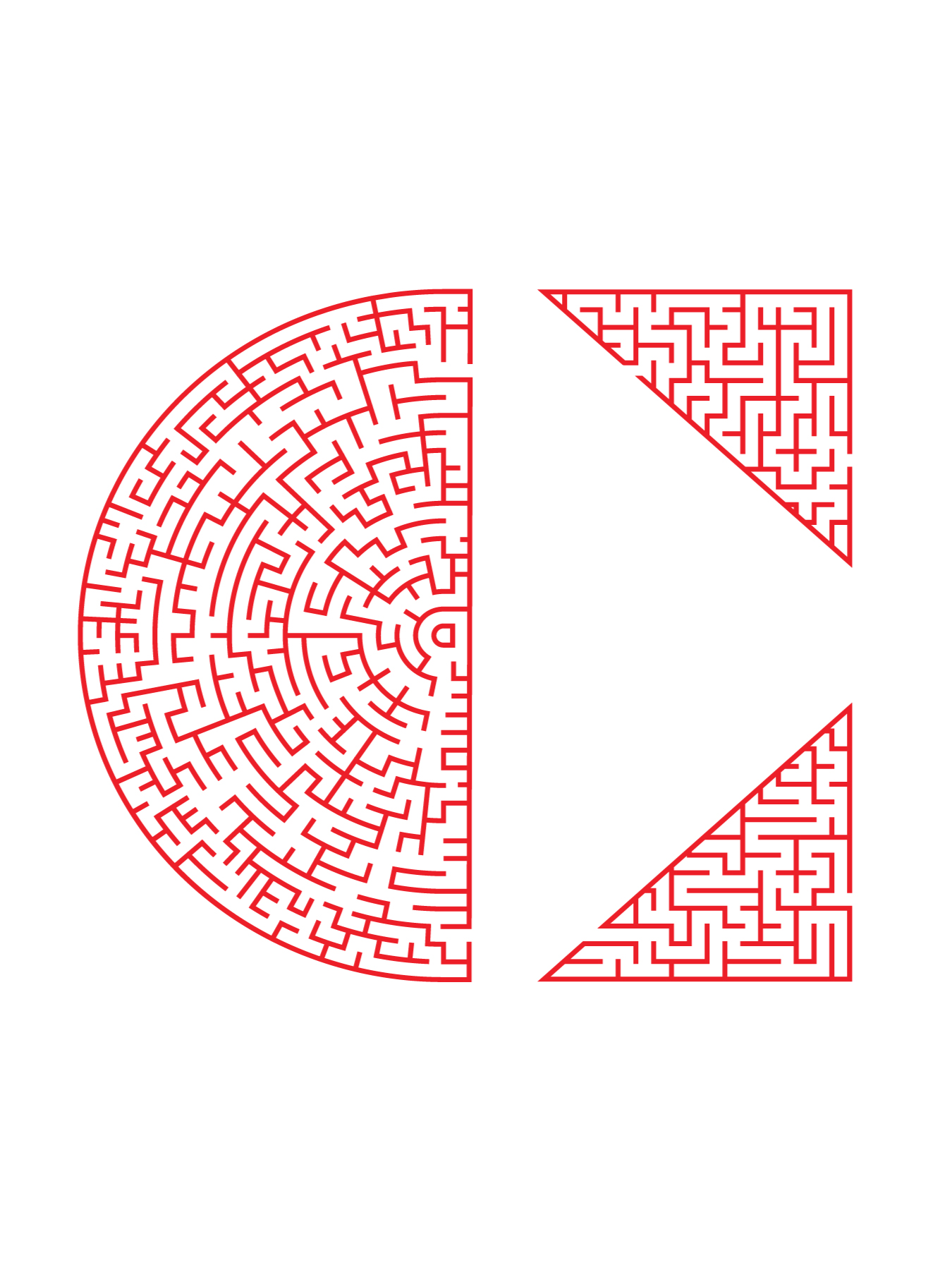
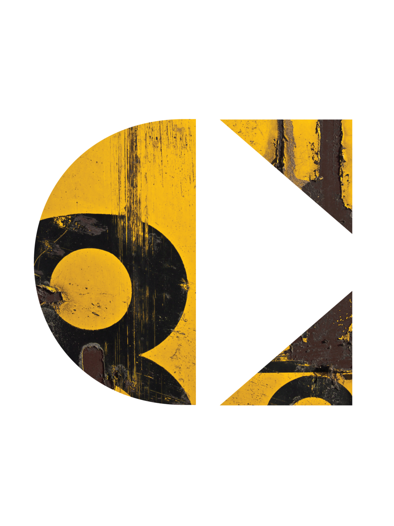
At its centre, a typographic C became the primary symbol — representing Community, Certification, and Canada.
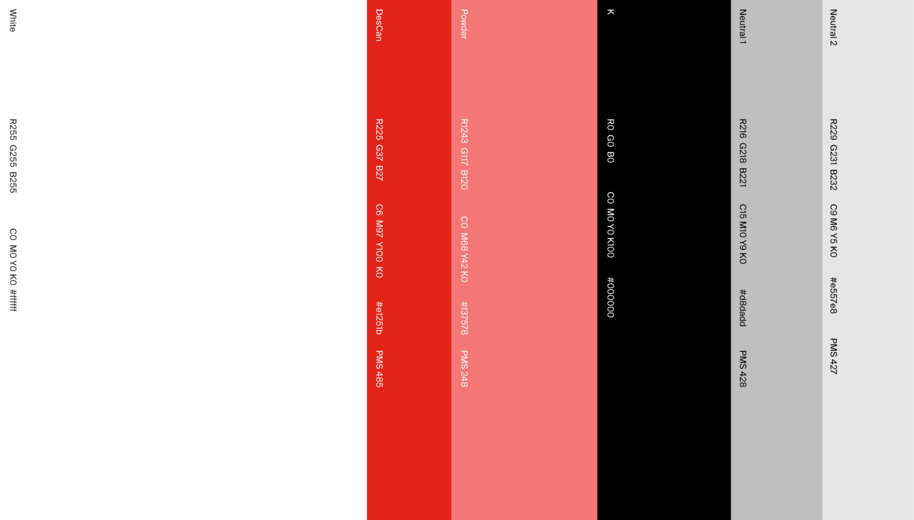
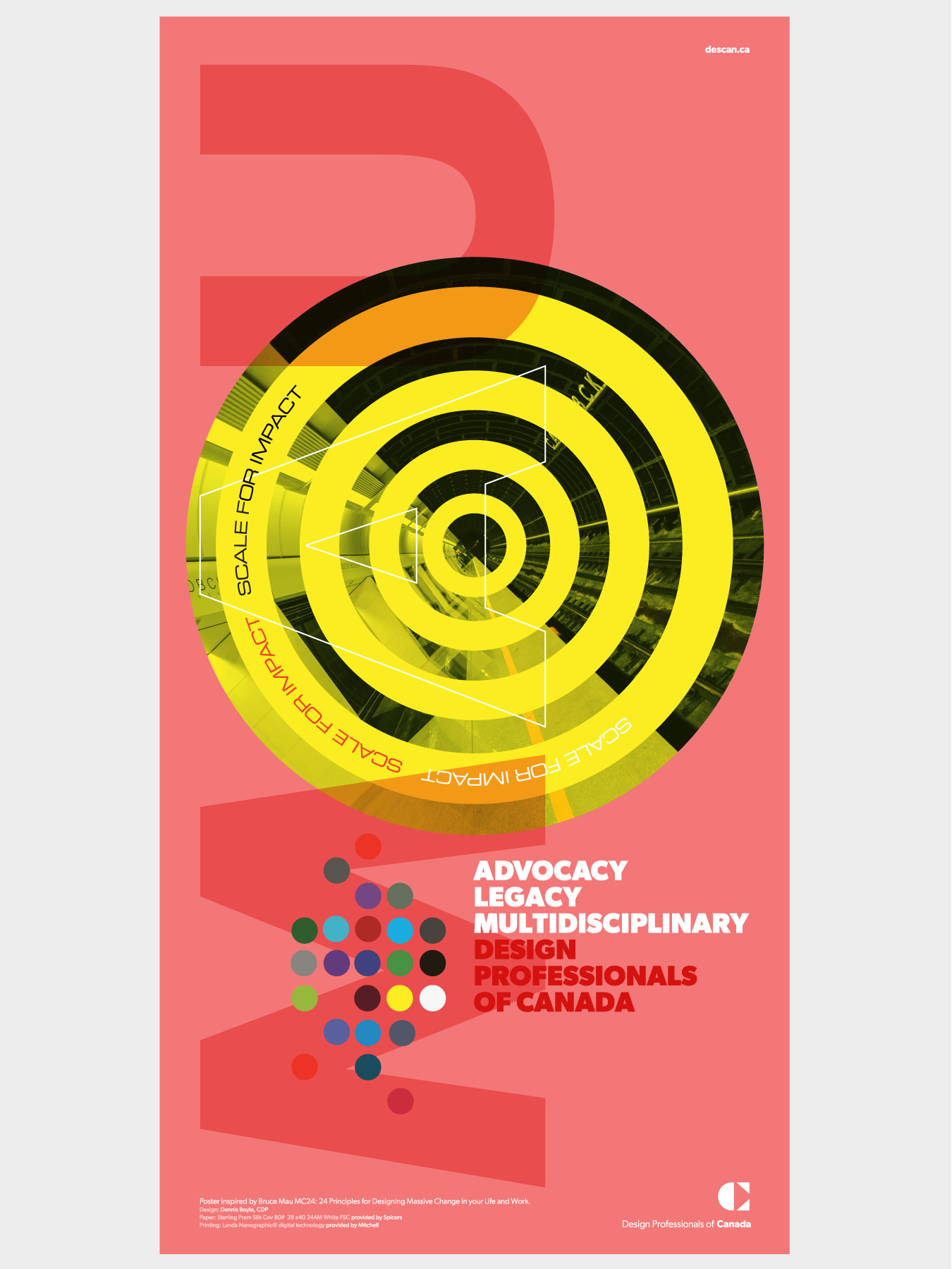
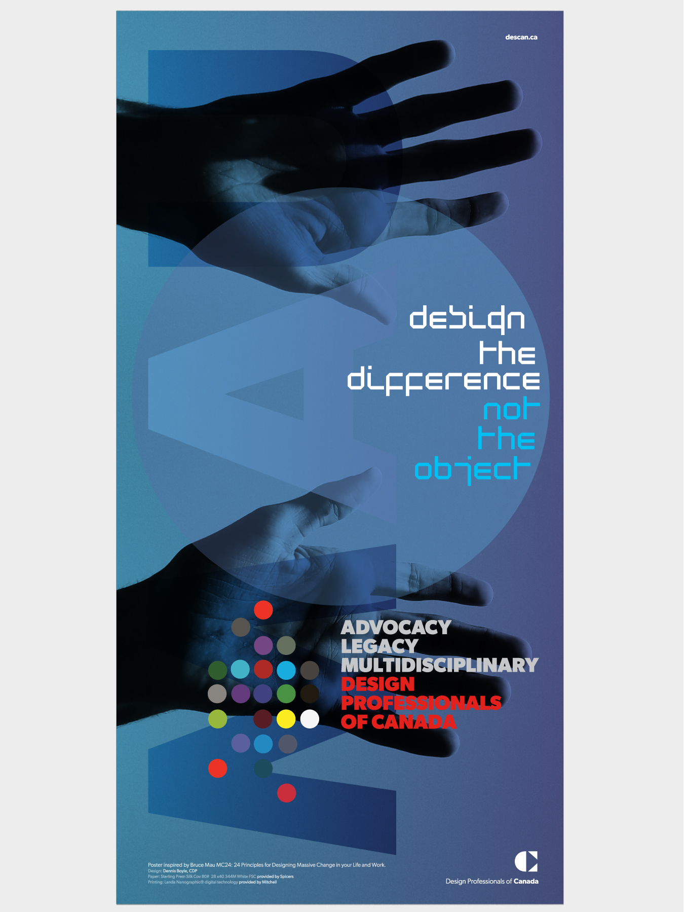
The mark was supported by a more contemporary type and colour system, creating a visual language that could feel current without discarding the organization’s authority and history.



Designing Around the Needs of a Broader Membership
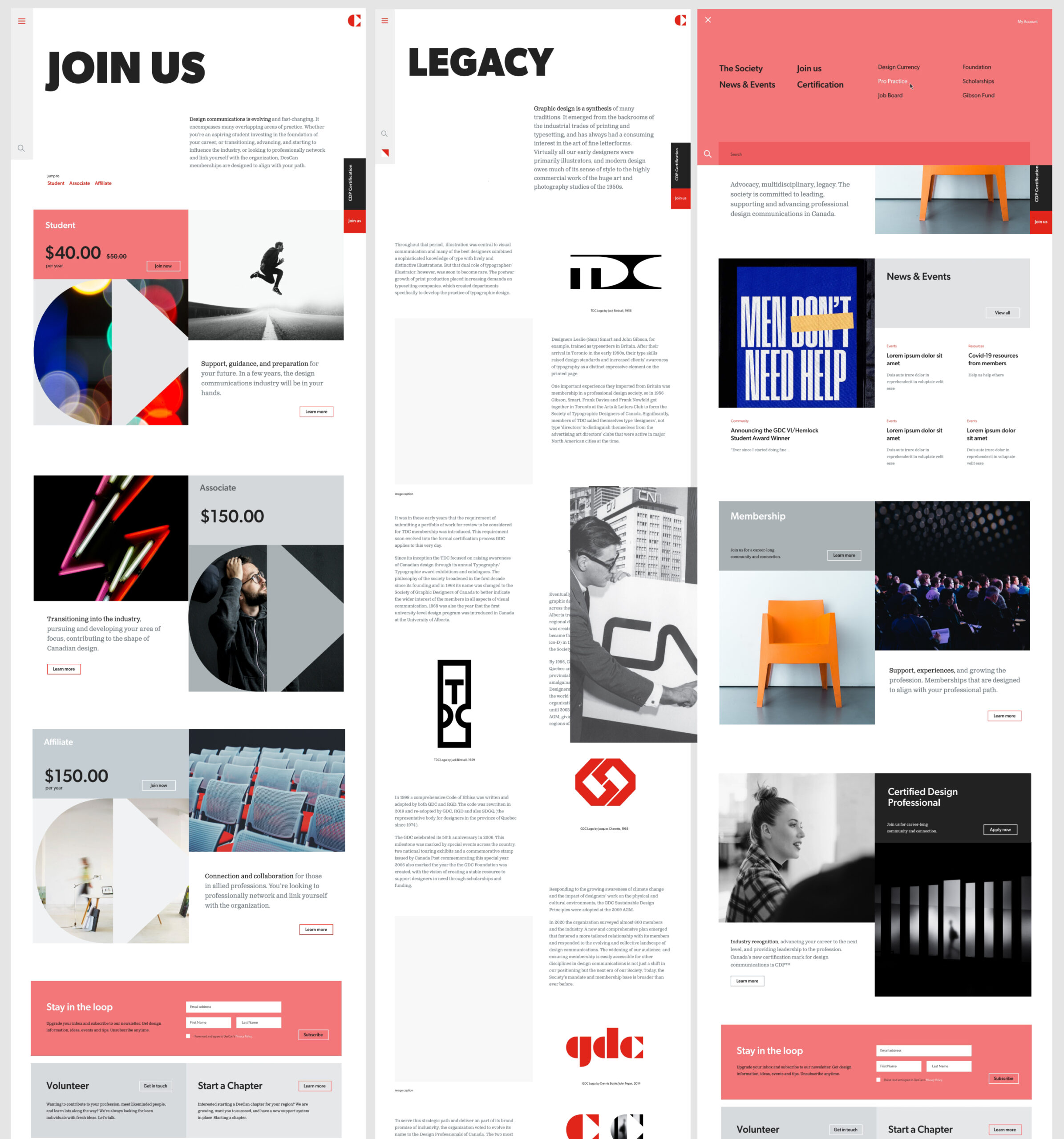
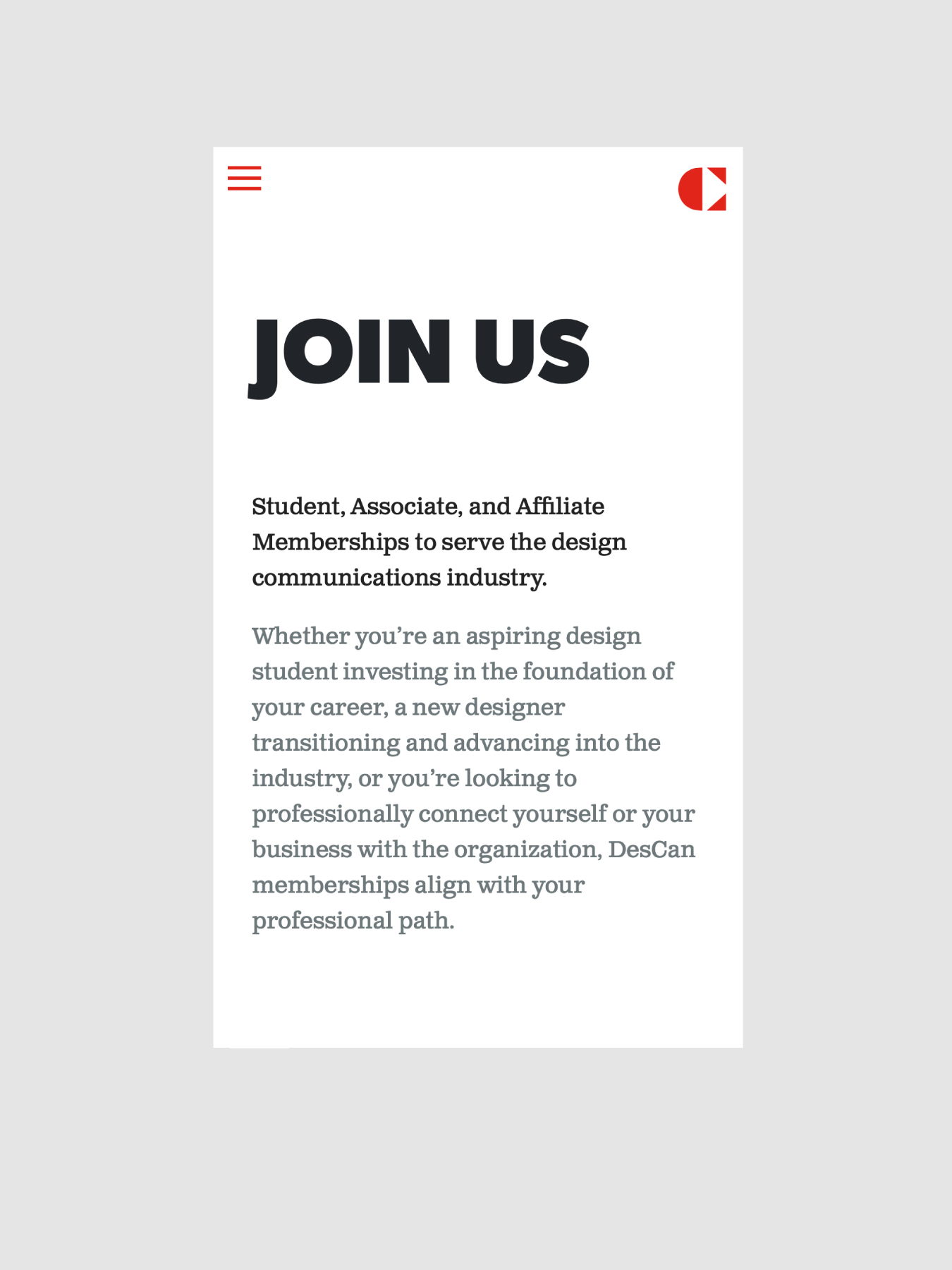
The new identity also needed to work harder digitally. DesCan served multiple membership segments with different needs, interests, and levels of engagement.
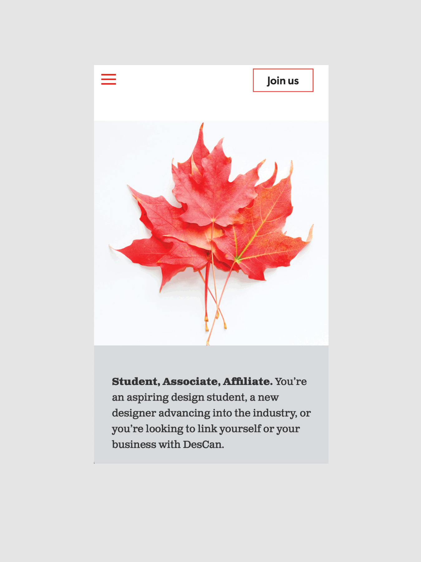
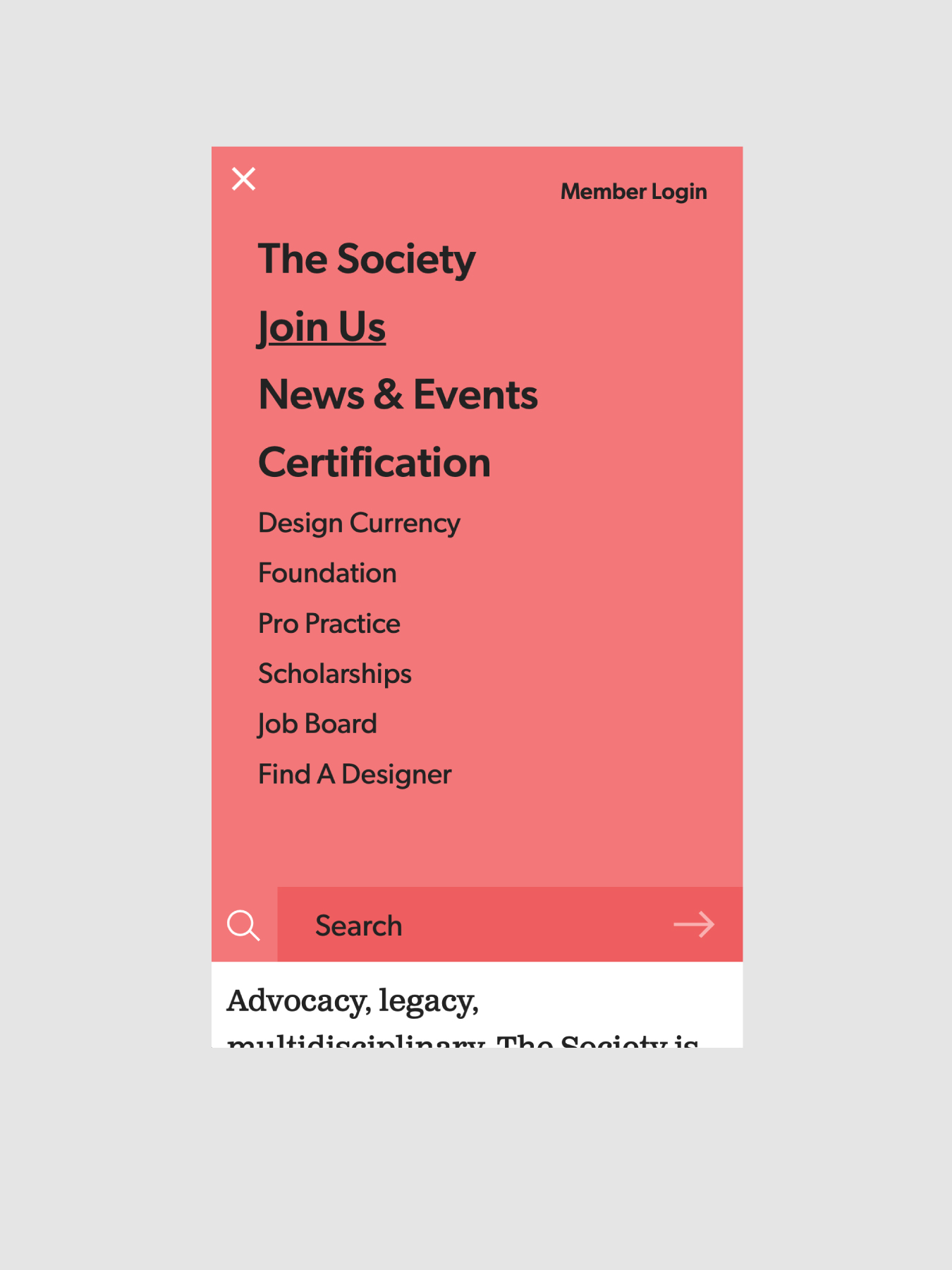
A new digital strategy was developed around those audiences, bringing the organization’s positioning, messaging, resources, and visual system together in a more intuitive and contemporary online experience.
The goal was not simply a better website. It was a clearer way for members to understand where they fit, what value DesCan offered them, and how they could engage with the organization. DesCan – BoyleDesign

Protecting the Value of Professional Standards
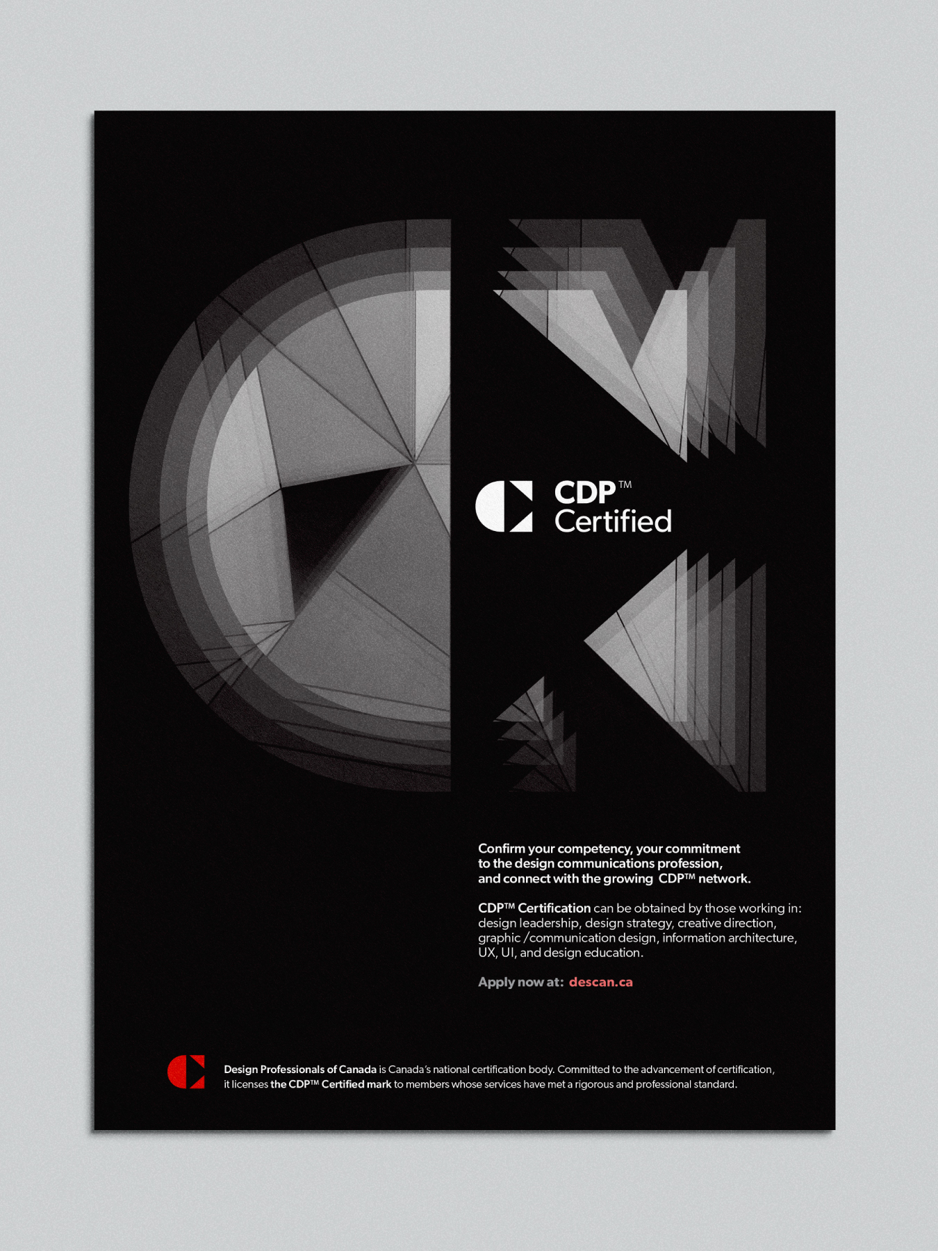
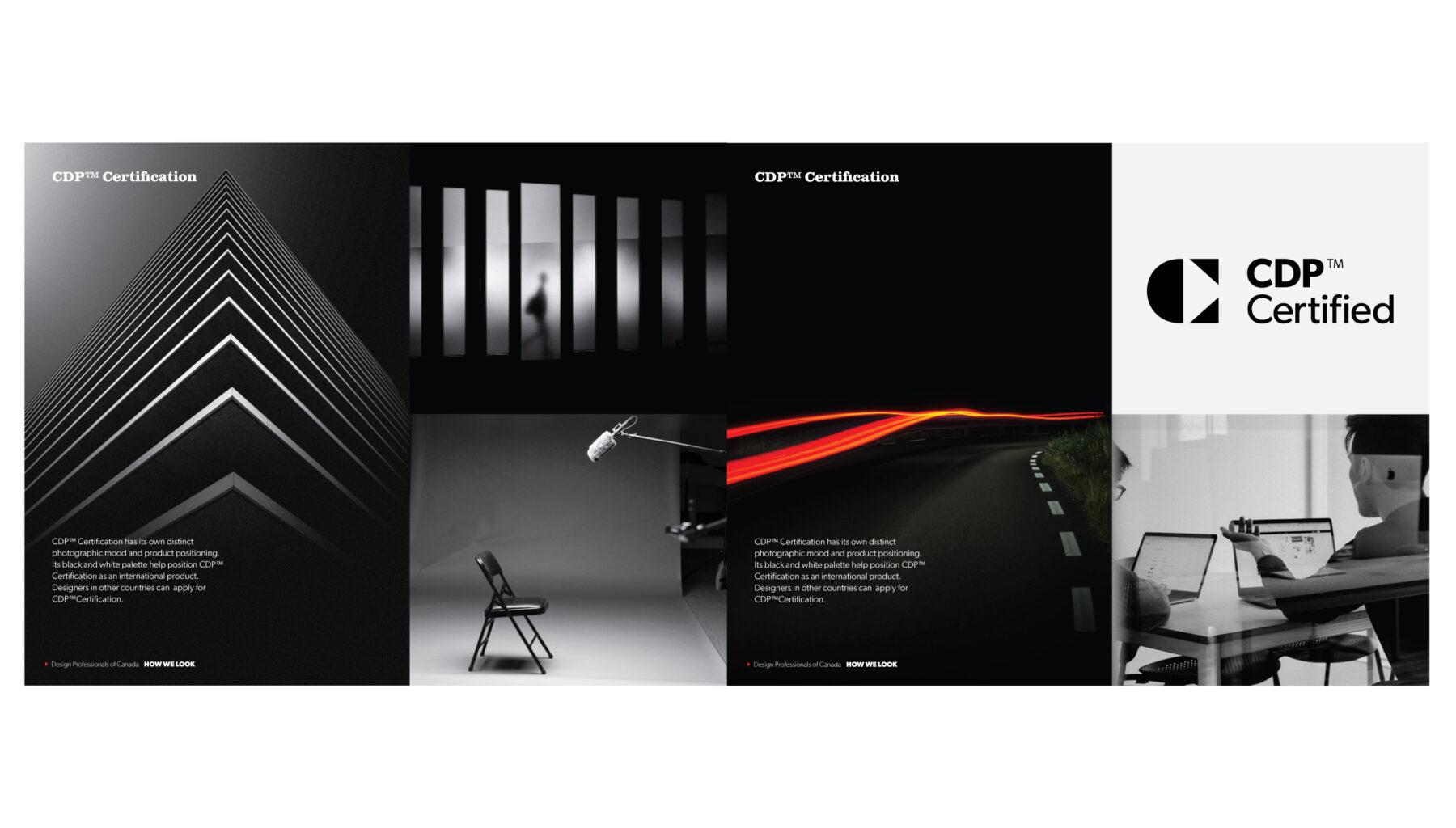
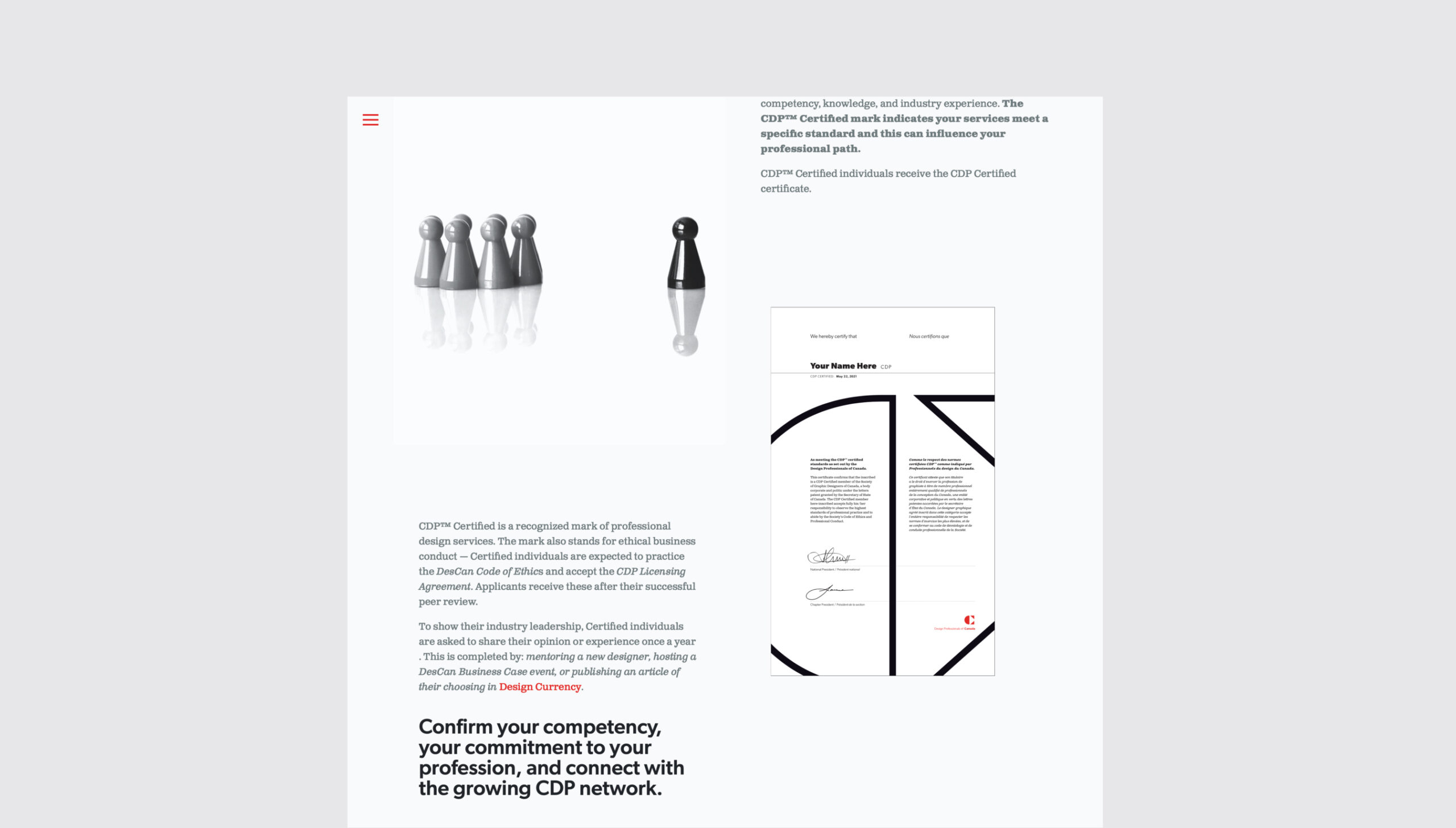
One of the most important elements of the organization’s equity was its CDP™ Certification.
The certification represented professional excellence, leadership, and rigorous standards within the Canadian design community.
Rather than treating it as a secondary program, the new system reinforced its role within the broader DesCan brand.
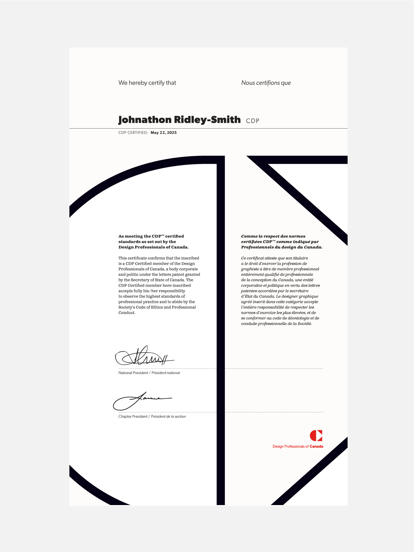
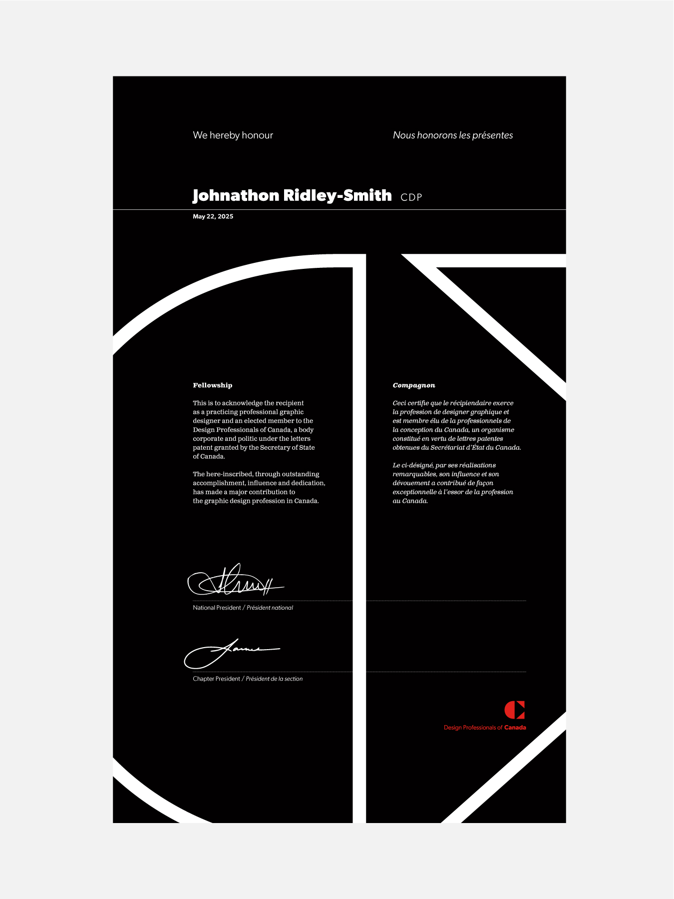
The certification identity was redesigned in collaboration with John Ngan, including distinctive CDP™ and Fellow certificates, helping ensure that professional recognition remained central to the organization’s future relevance.
Creating a Platform that Could Carry the Profession Forward
The result was more than a new name and identity.
DesCan emerged with a broader mandate, a clearer relationship to its members, and a more flexible platform for supporting an evolving profession.
The updated identity expanded the organization’s appeal across communication design disciplines, strengthened the role of CDP™ Certification, and created a more contemporary digital presence for member engagement.n Canada’s design community.
descan.ca
The association had the very good fortune to engage with Boyle Design, who accepted the monumental task of updating our brand identity.
Altering an identity that has successfully existed for half a century is always high risk, but even more so given the exceptionally discerning audience base we serve. The task required a strategic designer who could cautiously appreciate the risks while equally welcome the opportunities.
Boyle provided a comprehensive brand identity that we are confident will serve the association’s needs for the next several decades. Their strategic thinking went beyond creation of the identity and into deployment of the assets across the country. We are the ever-grateful beneficiaries of the thoughtful and creative guidance and stewardship throughout the process.
Melanie Macdonald
Director, CDP™
300%
website traffic growth